The Social Kitchen
Come Eat Together
SUMMARY
Build a full visual identity for a new restaurant concept, from logo to menus to packaging. Creating a cohesive brand system that reflects the restaurant’s values and leaves a lasting impression on every guest.
Solution
The Social Kitchen is envisioned as a warm, welcoming space built around connection; designed for young adults, families, and anyone gathering over good food. With this, the identity needed to feel fresh, thoughtful, and community-driven. The result is a brand that balances energy, comfort, and approachability.
Deliverables
Brand Identity, Menu Design, Brand Collateral, Style Guide
My role
Felicity Andrews, Designer

Brand Identity
The identity is anchored by a fresh, inviting color palette that reflects both vibrancy and warmth. It brings energy to the space while maintaining a sense of comfort.
Typography plays a central role in shaping the brand’s personality. Friendly, clean letterforms (paired with subtle custom ligatures) add character while remaining highly legible across applications. The system is flexible to live on menus, packaging, signage, and digital touchpoints without losing clarity or charm.


Menu Design
The menu was designed as a large-format experience that feels organized, approachable, and easy to navigate. The color palette helps distinguish food categories, guiding guests naturally through each section.
Clear typographic hierarchy separates dish names, descriptions, and pricing for effortless readability. Conversational “speech bubble” graphics are used to highlight food sections and chef favorites, reinforcing the restaurant’s social, community-focused theme while adding visual rhythm to the layout.


Brand Experience
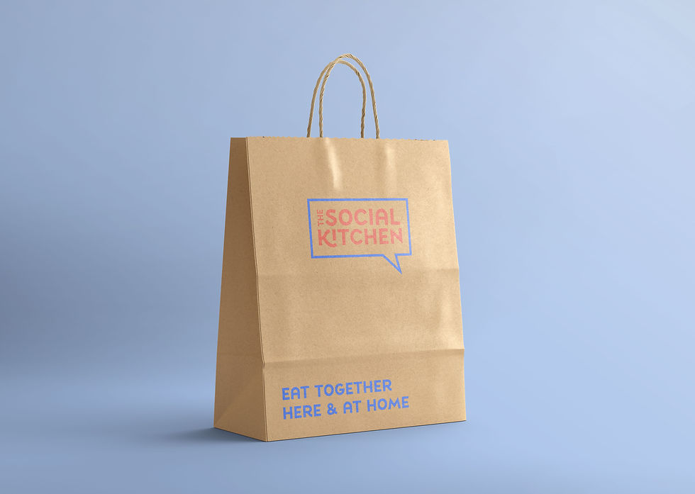
A full suite of branded materials was developed to extend the identity beyond the table. Cups, coasters, and to-go packaging were designed to feel consistent and intentional, reinforcing the brand at every touchpoint.
Store signage carries the same visual language, creating a seamless experience from the moment guests walk in to the moment they leave. Every element works together to make the brand feel thoughtful, unified, and memorable.


Behind the Scenes
The project began with a moodboard to establish tone, color direction, and overall atmosphere. Once the foundation was defined, I moved into logo exploration and sketching, testing different visual approaches before refining the strongest direction digitally.
From there, the system was built out in Adobe Illustrator, ensuring every piece worked cohesively within the larger brand story.


